The Rejection Function
When everything can be made, the designer’s job shifts from generating possibilities to deciding what isn’t worth making.
By Christian Saylor
, 5 min read
For most of design’s history, saying no was built into the process. Film ran out. Type had to be set. Shoots cost money. Budgets forced choices. The limitations were frustrating, but they did something useful: they narrowed the field before the designer ever had to make a decision. Now the field is effectively infinite. A designer can ask for twenty ideas, then twenty more, and get them all in minutes. The hard part isn’t making something anymore. It’s knowing what to reject.
A designer at a mid-sized software company sits down to start work on a finance app. It’s a spend management tool, aimed at the sort of person who controls a budget without owning the process around it, someone who spends their week explaining numbers to the person above them. He opens a chat window and describes the product the way he’d describe it to a new hire: the user, the context, the feeling he’s after. Modern, trustworthy, approachable. Then he asks for twenty directions for the main dashboard.
Ninety seconds later, he has them, and none of them are bad. They’re twenty competent, plausible, professionally finished screens. He looks at all twenty and feels nothing that resembles a decision. He likes four of them and couldn’t say why those four and not the other sixteen.
So he does the reasonable thing and adds more words. He gets more specific about the user, more evocative about the feeling. Twenty more arrive. They’re different, and they’re exactly as undifferentiated as the first twenty.
The tool hasn’t misunderstood him. It has understood him perfectly. His description simply didn’t exclude anything.
The brief has to do more than describe
This is the moment worth pausing on. It happens thousands of times a day in studios and product teams, and it comes down to one thing: knowing what to say no to.
Modern, trustworthy, approachable is true of all forty dashboards: the dense enterprise ones, the soft pastel ones, the severe dark-mode ones. A phrase that applies to everything on the table can’t help anyone choose among the things on the table. It describes without excluding, and a constraint that excludes nothing constrains nothing. What it leaves behind is a person scrolling a grid of thumbnails and picking whichever image is most arresting. That’s preference dressed up as judgment.
Compare it to what a different designer writes for the same problem: it should read like a tool a finance lead can defend in a procurement review, not like a startup. Where warmth and precision conflict, precision wins. Nothing that would look at home on a wellness app.
That’s barely more descriptive than the first version. It’s, however, enormously more decisive, because for the first time it says what to throw away. An entire segment of the space (the friendly, rounded look) is eliminated before anything is drawn. What comes back is a smaller set, and more importantly, one that can be evaluated against something other than itself.
This suggests a test, and it’s the most useful thing a designer can carry into this new way of working. For any line in a brief, a prompt, or a conversation with a model, ask: can this be used to reject something I’d otherwise like? If it can’t, the line is decoration. “Modern, trustworthy, approachable” fails the test. “Precision wins” passes it, and it passes for the reason that matters: it costs something. It surrenders the warmer half of the space before anyone has seen what was in that half. A line that costs nothing buys nothing.
More options don’t make the decision easier
There’s a second, quieter failure hiding in that grid of forty options, and it explains why the situation doesn’t improve with volume.
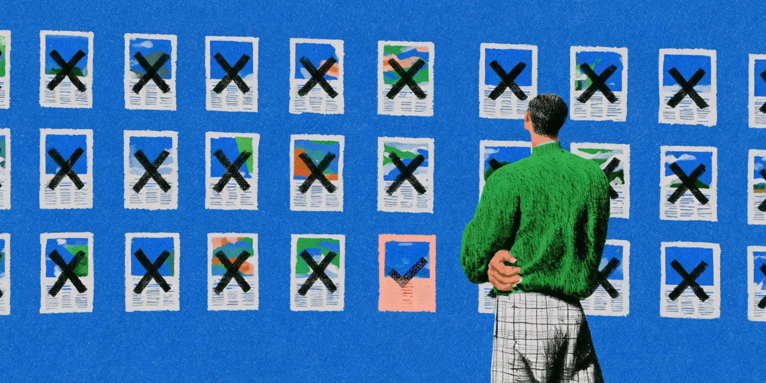
Faced with many alternatives at once, people stop judging each one against a standard and start judging them against each other. The eye reaches for whatever is most novel or most striking in the set, because relative comparison is what it does when it has nothing absolute to hold onto. Forty options don’t sharpen a decision; they dissolve the criteria the decision required. The ceiling doesn’t rise with the count, either. Forty samples drawn from the same starting assumptions give you more of what’s already there, not something different. The only thing that raises the ceiling is what got ruled out before the first pixel appeared.
Which raises the question of why this feels so unfamiliar: why capable designers, with decades of collective craft, are suddenly poor at a task that sounds like the easiest part of the job.
The answer is that they never had to do it before, at least not at this scale, because the constraints of production used to do it for them. A photographer with thirty-six exposures on a roll made a small number of deliberate frames, not from discipline but because the roll said so. A print run that couldn’t be revised concentrated the mind wonderfully. Type that had to be physically set, a shoot that cost real money, a budget that allowed two concepts instead of two hundred: designers experienced these as limitations and complained about them for a century, but every one of them was doing quiet, necessary work. Cost and physics eliminated most possibilities before taste ever got consulted. What reached the designer’s desk was already narrowed to a size a person could actually think about.
When the medium stops saying no
That narrowing has now been removed, and nothing has replaced it. Generative tools have no opinion, no fatigue, no budget, and no capacity to be embarrassed. They’ll produce the thousandth variation as readily as the first, and they’ll never volunteer that none of them is worth making. Refusal, which used to be a property of the medium, has become an explicit act of authorship. Somebody has to perform it on purpose.
Nobody wants the roll of film back. But the function constraints used to perform still need to happen somewhere, and now it lives in the brief, or the prompt, or the long first conversation (increasingly the same thing). Its job has flipped: it used to point at what the designer wanted, aiming scarce effort correctly. Now it determines what the designer won’t accept, so abundant effort doesn’t get wasted on a field of plausible mediocrity.
One caution comes with that, and it’s not a small one. Refusal isn’t the same as certainty, and a brief that forecloses every question returns exactly the thing already in the author’s head, rendered competently and improved not at all. The discipline is to settle everything the work doesn’t depend on and leave one question genuinely, explicitly open: say, in writing, this is the part I don’t know, show me both and make the case. Openness stated is an invitation. Openness by omission is only a gap, and whatever wanders into it gets rejected on grounds nobody wrote down.
The designer with the finance app eventually shipped something good. The forty dashboards took ninety seconds and taught him nothing; there was nothing in them that couldn’t already have been there. What mattered happened in three sentences he wrote afterward, and their value was in what they made impossible.
That’s the strange shape of the craft now. The most consequential thing a designer produces may be a line of text that eliminates a thousand images no one will ever see: work that leaves no visible trace in the final product, can’t be shown in a portfolio, and looks from the outside like someone sitting still. It’s the part of the job the machines haven’t touched. They’ll make anything asked of them. They’ll never say something isn’t worth making. Until they can, that sentence belongs to us, and it’s worth learning how to write it.
By Christian Saylor, brand designer and founding partner at EKKO Studio